Design Examples


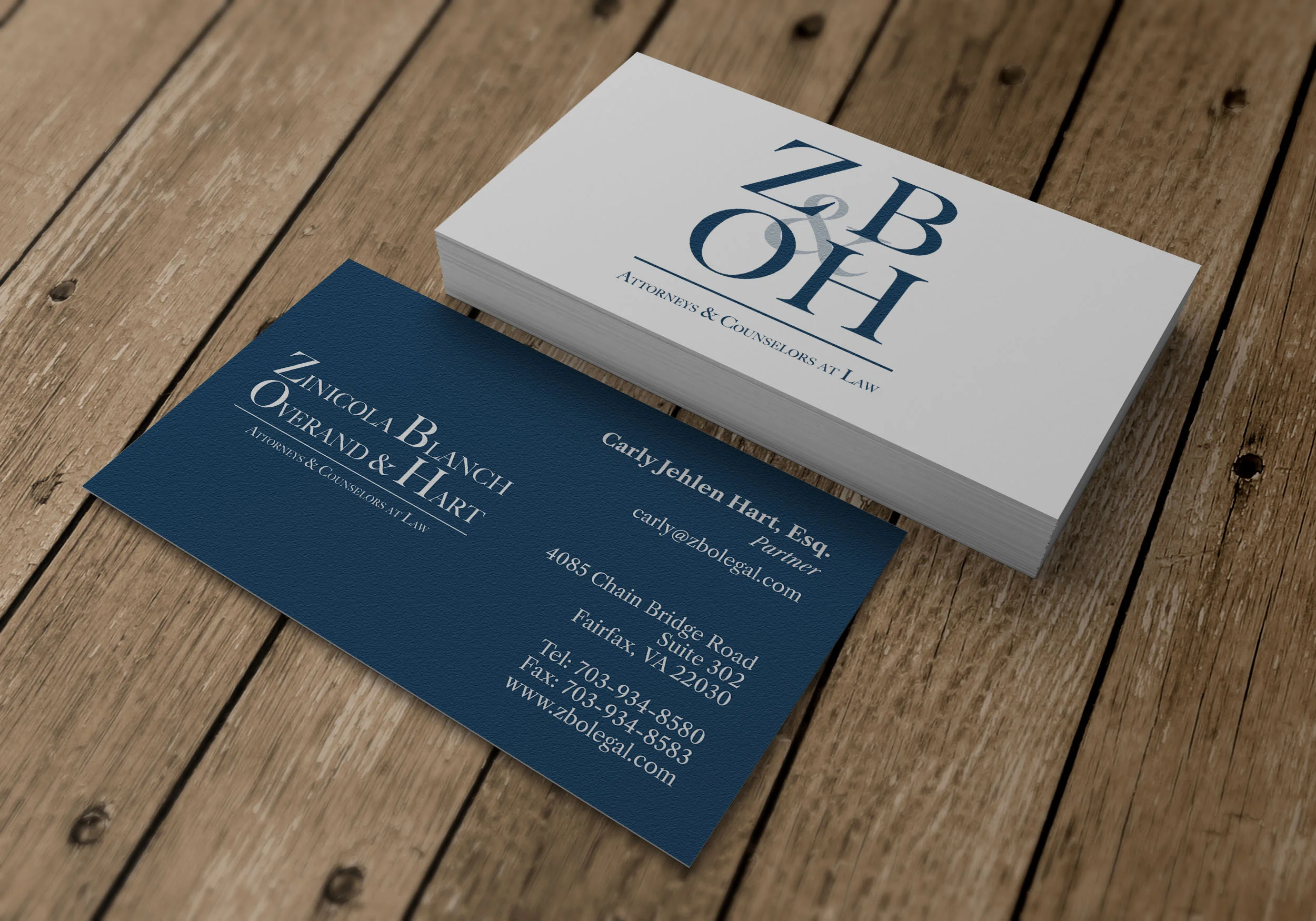
Our ZBO&H Redesign included Logo creation, general branding guidelines, and document creation. The finalized business cards feature both the wordmark design on the front, as well as the simplified lettermark logo on the back. Variants of the card include a version that replaces the back with a declaration of fifth amendment rights.
The Kolbe Baseball Card was a stylized presentation of the company employee’s Kolbe Profiles. While the default presentation of a Kolbe Profile is vertical, this creates an inappropriate impression that higher numbers or scores are “better”. We choose to display the profile information horizontally and in multiple ways to present every category as a strength, while maintaining context.
Zenmingo Spec Logo
The Zenmingo Spec Logo is designed to showcase various aspects of the brand. The flamingo iconography represents the mascot, and incorporates the concept of "balance” and “zen” through utilizing both vertical and horizontal abstractions of Yin and Yang. The logo comes together with the impression of a letter “Z” formed in the center.
The Residential Company Profile is a document created to showcase the type of work done by the company in a clean, professional, modern way. Starting in 2018 we redesigned all of the company’s documents for consistent branding, and incorporated many of the same design elements into the website.
Fukinsei design principles – Fukinsei is a Japanese word meaning “without symmetry” and is a core element of Japanese design philosophy. We utilized an asymmetrical grid design for the document to give it a clean, striking layout that is able to highlight the wide-aspect photography on a vertical-orientation page.
Consistent layout – The layout, while asymmetrical, flows consistently from page to page, placing headers, titles, imagery, body text, in consistent locations so that the reader never struggles to find the information they are looking for, making skimming the document for a particular section easier.
Original, honest photography – We took every photograph presented in the document, ensuring consistency and quality across the visual portfolio. Many companies in the industry rely on manufacturer or stock imagery, but our goal was to hold up any image as a real-world example of the work the company can accomplish.
Photo Editing
Top: Fixed, Bottom: Original with distracting element circled
Occasionally I’ve been asked to edit photos that I didn’t take. In the above two examples, the wedding photographer captured the videographer very prominently in two important images. These edits involved complex reconstruction of the backgrounds from other images (taken from other perspectives), editing the cameraman out through masking, cloning, etc., and then reconstructing the scene as appropriate.
Left: Original, Right: Edited
While the difference between the two images isn’t overly dramatic, a number of changes were needed to make a bad image usable. The highlights include:
Aligning theater seats
Removing orange haze from image & general color correction to reveal floor color
Fixing the pillows to present better, reshaping individually to create a natural look
General additions and fixes including highlight recovery, cable removal, lens flare, etc


